
Design canvas
A design artifact holds HTML and CSS screens rendered in the browser. Open a design artifact and the Design tab gives you a full canvas to view, edit, and present those screens. The Comments tab sits beside it for feedback pinned to the canvas.
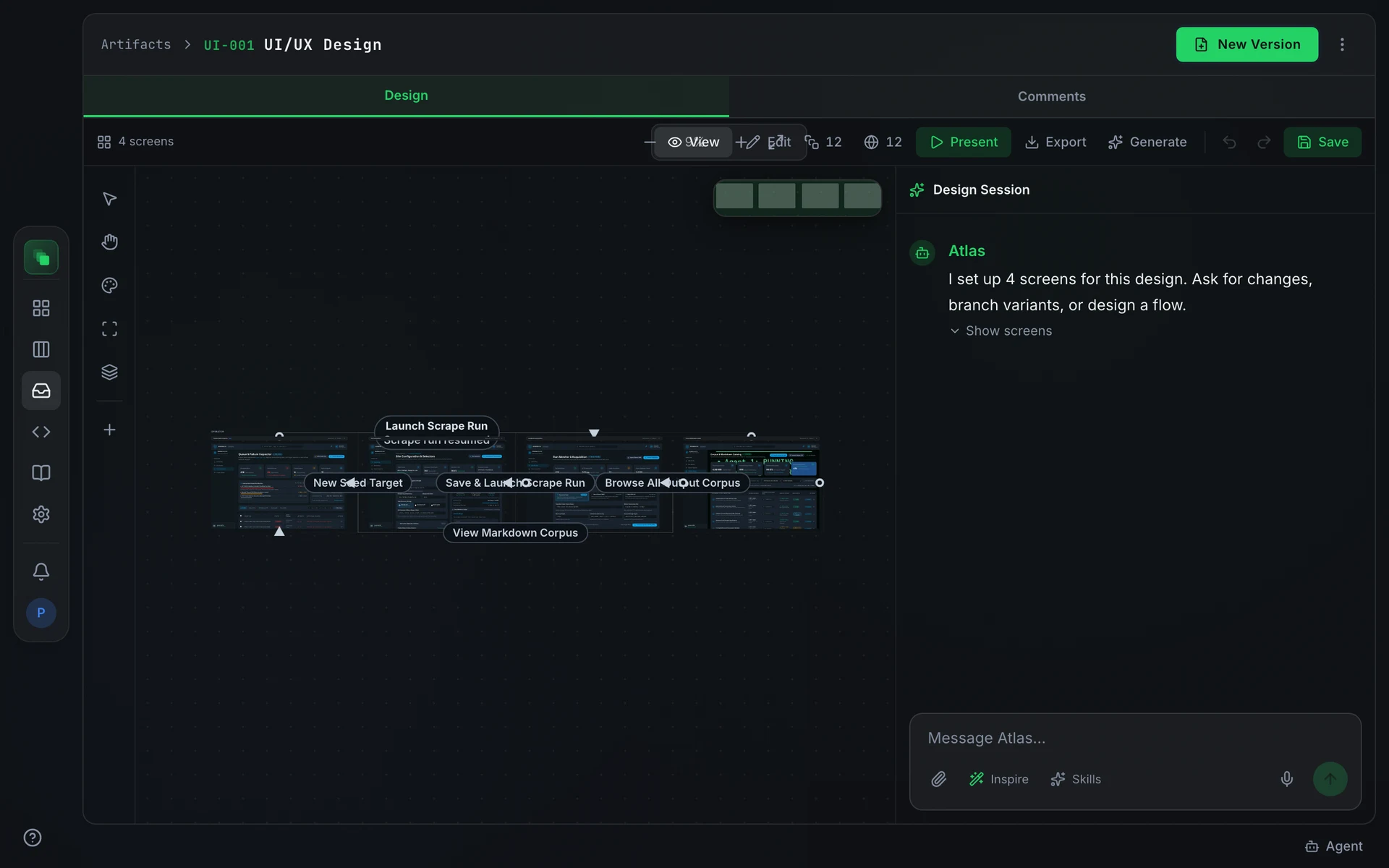
Top bar
Left rail
Design Session
The Design Session sidebar is a chat scoped to the canvas. Its opening prompt on a fresh design reads: Ask for changes, branch variants, or design a flow.
How your instruction is applied depends on what you write:
- Full rebuild. Instructions containing words like "redesign", "rebuild", "from scratch", or "entire page" replace the selected screen's HTML completely.
- Restyle. Global style directions such as "darker", "change the color palette", "different typeface", or "more minimal" update the design system and apply the change across all screens at once. Mentioning a specific element (button, header, card, and similar) in the same instruction suppresses global restyle and routes the change to a targeted patch instead.
- Targeted patch. All other instructions apply a surgical search-and-replace diff against the existing HTML of the selected screen or screens.
Select a screen or element before asking to pin the change there. A style direction with no selection and no element name always goes to the design system.
Frame toolbar
When a frame is selected, its toolbar switches between Edit, Branch, and Flow.
Brand assets
The Brand assets panel has two drop zones:
Requirements panel
Design artifacts capture UI requirements that connect the canvas to the PRD. Each requirement shows a status badge:
Requirements with Not in PRD status block approval. When any are present, the panel shows: "Approval is blocked until each of these is sent to the PRD or dropped." Press Send to PRD to open a PRD amendment, or the X to drop the requirement. Approval opens once every blocking requirement is proposed or dropped.
Present mode
Press Present in the top bar to start a presentation. The player varies by artifact type.
For design artifacts and wireframes, PrototypePlayer opens a full-screen click-through of the canvas, following the navigation connectors between screens.
For deck artifacts, DeckPlayer opens a presenter view with:
- A filmstrip along the bottom showing all slides
- A presentation timer showing total elapsed time
- A per-slide elapsed counter with an over-budget indicator when a slide's time budget is exceeded
- Speaker notes embedded in the slide (read from each slide's content)
- A New window button that opens a standalone presenter window with speaker notes for side-by-side presenting
Navigate slides with the on-screen arrows, the left and right arrow keys, or the Space bar.
Upstream changes
When a source the design was built from changes, the metadata sidebar shows Upstream Change. Choose Regenerate from the overflow menu (⋮) to produce a fresh draft from the updated sources.